Week 9 (Dec 2): Presentation #1 - screen real estate
Generalized Fisheye Views
George W. Furnas.
“In many contexts, humans often represent their own ‘neighborhood’ in great details, yet only major landmarks further away.” This is the motivation of inventing and using Fisheye. In many computer interfaces such as a menu or a table, people are offered equal details regardless of where their focus resides. Such equal representation, to some extent, is a waste of visualization of details that people can not possible capture. For example, people can only read limited lines of documents at a given time. Hence it makes little sense to emphasize much on those unreachable lines. Albeit such lines offer necessary context for readers to understand the document holistically, it suffices to show limited level of details instead of offering full details.
One interesting experiment raised in the paper is authors asking test subjects to list examples for certain topics (e.g. states, presidents, etc.). And people showed a psychological fisheye effect. For instance, people firstly came up with states that are either of high a priori importance (New York, California, etc.) or closer to their own. Psychologically, people are also confined by geographical factors – their knowledge and perception are affected by a priori importance (locally high, farther then lower).
The paper formalized fisheye view by defining ‘Degree of Interest’ (DOI). A generalized formula is:
DOI(x | .=y) = API(x) - D(x, y)
Essentially, given a point x, the degree of interest is equal to an a priori importance of that point, subtracting the distance of x from the current focus y.
Having had this equation, the incoming questions is identifying and calculating a priori importance and distance. The first example given in the paper is calculating DOI in a tree structure. In a tree structure, the a priori importance of a node can be defined as inversely proportional to the distance from the root. While distance is the number of links connecting two nodes.
Another example is using fisheye view in source code. The outcome of the fisheye view is a more clear structure of the program with local lines of code fully displayed and other less important lines concealed. Maybe confined by the technology at that time, the result does not look promising and some quick improvements could have been made such as offering more hints about global lines of code and highlighting local lines of code. The binary (appear or disappear) scheme seems to be too simple.
One lesson learned is an analysis after the tree example. Such further and explicit study actually adds more to the impact of the algorithm, than simply presenting the example.
Data Base Navigation: An Office Environment for the Professional.
Robert Spence and Mark Apperley. Behaviour and Information Technology, 1(1), pp. 43-54, 1982.
Summary
This paper describes a conceptual set-up for accessing large volumes of hierarchical data from an office that currently has no computer, without requiring that the professional in that office learn any new modes of interaction and with minimal new devices added to the office. The result is a set-up that requires the use of pointing, speaking, and visual scan; provides access to large volumes of information; and shows a detail-in-context view of the required information by using a Bifocal Display.
Context
This paper was written in 1982 with the idea of designing an “Office of the Professional” of the time in mind. As such, the assumptions the authors made were that:
- Professionals wouldn’t allow computers or keyboards into their offices.
- Professionals had secretaries for support and for “highly efficient organization of information”.
- Professionals must deal with a large volume of information in many forms, which is why computerization of the office is badly needed.
The authors’ goal was to design a system that would require little skill, natural actions (pointing, gesturing, speaking, touching), little intervention in the appearance of the office, and rely on perceptual principles. Despite these assumptions no longer describing the typical creative professional today (except for the third one), the goals are not so different from the goals we still have today, and the underlying concepts are still relevant.
Concept
This paper describes a conceptual computer system for accessing information inside of an “Office of the Professional” in 1982. Though the system was not actually implemented, the authors draw on existing technologies that they claim are advanced enough that an implementation would actually work. The concept is described as follows:
The data to be accessed is organized as a hierarchy, following the typical way journals are organized (database > libraries > journals > volumes > issues > articles or items).
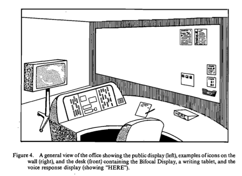
Visual scan. The authors note that spatial memory and search by visual scan are operations that humans are highly efficient at, and so items should be easily located by visual scan as much as possible. Thus the system represents journals as icons in full view of the professional. They envision these to be physical artifacts (such as coloured cards) on the office wall. Because they rarely change and remain in the a wide peripheral field of view, their locations can be memorized and easily found. An optional dynamic display area could be added to extend the number of icons that can be shown.
Teletouch. To select a journal, the professional can point to it with a “teletouch” pointing device which illuminates the journal that is being pointed at. The authors argue that touching and pointing are equally natural, but pointing means that the icons do not have to remain at arm’s length.
Selection. Selection of a journal is completed by voicing a command while pointing. A small feedback display on the desk displays which command was understood.
Examining data. To allow the professional to quickly become aware of the contents of the selected journal (including noticing new items), the authors suggest using a bifocal display, which essentially displays one element in the middle of the screen but shows everything else as compressed on the sides of the screen, so that the user is still aware of certain characteristics of the data even if the details aren’t visible.
-jagoda

A Framework for Unifying Presentation Space M.S.T. Carpendale and C. Montagnese. In Proceedings of ACM Conference on User-Interface Software Technology, UIST'01, CHI Letters Vol. 3 Issue 2, p 61-70, ACM Press, 2001.
Problem prompt:
While we have seen rapid advances in available CPU power and memory the common sizes of our computational display spaces have only minimally increased or in some cases, such as hand held devices, actually decreased.
This paper presented a unified framework offering a geometric presentation library in which presentation variations are available independently of the mode of graphic representation.
This is a framework that unifies distortion and non distortion presentation paradigms.
This framework is called an Elastic Presentation Framework (EPF) since many of the described solutions are "elastic" in the sense that the adjustments and reorganizations offered are readily capable of reverting to previous presentations. The term elastic reflects the resilient

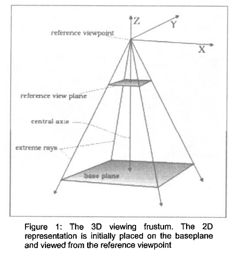
The basic manipulation is based on a concept of a lens. The basic geometric concept is to place a two-dimensional information representation on a plane in three-dimensional space.
But what is a lens?
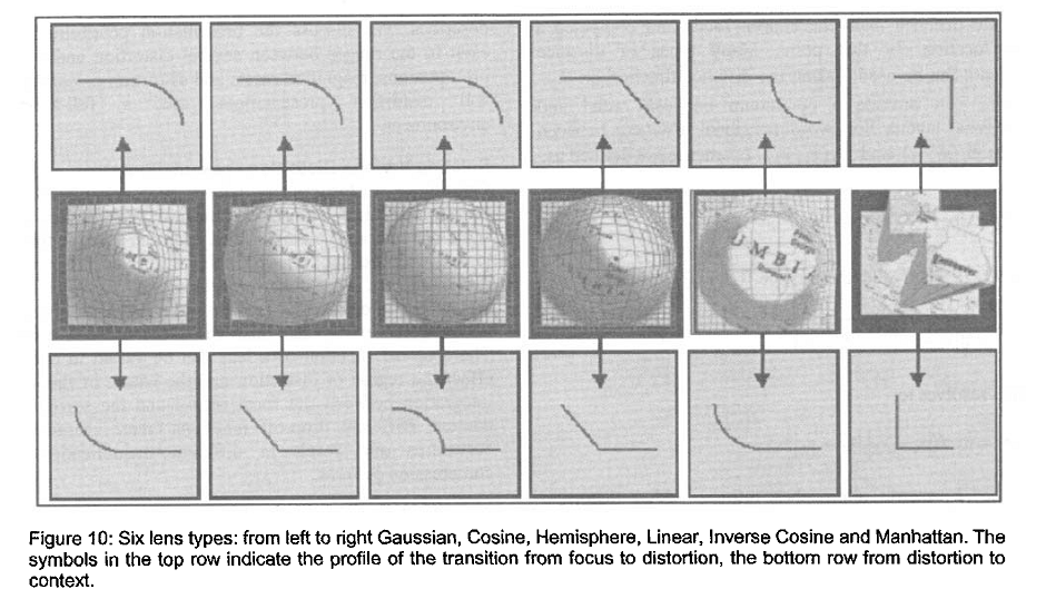
A lens has a focus, a region of distortion, a distance metric, a viewer aligned vector, and a radius. A lens focus has a degree of magnification, center, a shape, and size information such as radius, width or length.

^^^ Examples of the effects of the 6 lens.
Using these lens we can create the distorted and non distorted views required.
-jonathan