Rethink the Food Label Visualization
Stephanie Mikulecky
Sheelagh Carpendale
Entry for Rethink the Food Label contest hosted by GOOD and News21.
Visualization Guide
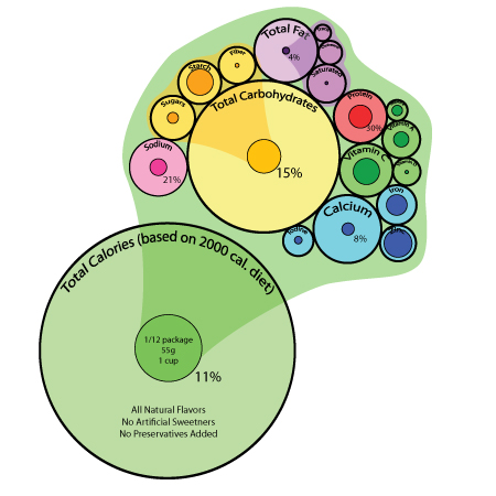
Each “bubble” consists of two main parts – a lighter-coloured outer bubble, and a darker-coloured inner bubble.
Main Calorie Bubble: The outer bubble is based on the average daily recommendation of a 2,000-calorie diet. The inner bubble indicates the percentage of your daily calories that the product you are viewing will fulfill. Various alerts, allergy warnings, and notifications concerning the project are displayed on the outer bubble, while serving size is indicated on the inner circle.
Nutrient Bubbles: The outer bubble indicates the total daily recommended value of a given nutrient. Size is determined by an approximate weight (grams, micrograms, etc.) that is recommended per day. Color is determined by nutrient groups (such as minerals are blue, vitamins are green, fats are purple, etc.). The inner bubble indicates the actual percentage of the named nutrient contained within the given product.
Note on Funnels: The coloured pie-shaped funnels indicate a breakdown of a nutrient into component nutrients. For example, the “Total Carbohydrates” bubble can be broken down into three main component bubbles – “Sugars”, “Starch”, and “Fibre”.